
#1


Many thanks to the left-handed quilter, Gene, Linda, and Mary for your opinions on the moose backgrounds. I always appreciate your help. Mr. Cowboy wanted me to audition more fabrics but secretly I think he likes to make suggestions on colors but doesn't me to discover that he's into the process.
Anyway, here's more takes on backgrounds. Your thoughts please!!
#2
#3
#4
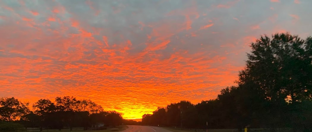
Many thanks to the left-handed quilter, Gene, Linda, and Mary for your opinions on the moose backgrounds. I always appreciate your help. Mr. Cowboy wanted me to audition more fabrics but secretly I think he likes to make suggestions on colors but doesn't me to discover that he's into the process.
Anyway, here's more takes on backgrounds. Your thoughts please!!


8 comments:
Love number 1. Looks like it's a beautiful sunrise or sunset behind Mr Moose
could you layer 3 or 4 behind the body of the moose and then use 2 as the background?
I agree with Gene, use the medium brown as the body and background number 2. I love the design! Mr. Cowboy cracks me up.
Number 2 is my fave! Makes me think of the woods!
I agree with Gene, too! I love #2 as the background - but not inside the moose - if that makes sense - LOL - ;))
I'm with most of the comments on this one...but....could you 'anchor' his feet into something that looked like foreground (perhaps some of #4) and then use #2 as more of the distance behind. Adding a bit of #3 'inside' the moose would look great too.
I really like 3 then 4 - what a cool moose!
I know you long ago made your decision, but for the record, I like the contrast on #3, and feel he gets lost in 1 and 2. 4 is okay. =) I look forward to seeing what you decided.
Post a Comment